Winair’s ‘Logo-in-a-hurry’ still in use after 55 years

© By Jerry Casius
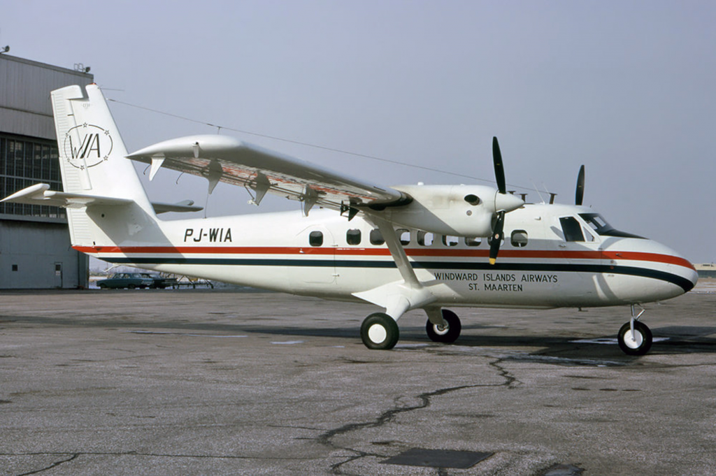
I am always pleased to see the original color scheme of Winair’s Twin Otters, which was actually designed by yours truly, the undersigned, in 1966. When towards the and of that year the construction of Winair’s very first Twin Otter (PJ-WIA) was nearing completion, the De Havilland Canada (DHC) factory in Donsview, Ontario, asked how we wanted the aircraft painted. Until then Winair did not have a company livery. Our airplanes were painted in a hodgepodge of color schemes, simply as they happened to be painted when they were purchased. So, founder-general manager Georges Gréaux passed the message on to myself: “Can you draw up something?” There was some urgency involved and I went to work on what was a very pleasant job. In a weekend I drafted the design which is still being used today as Winair’s trademark.
Base color
That the aircraft had to be white as the base color was obvious, because this lowered the temperatures inside the cabin. I had learned this from my earlier work as a Dutch Air Force mechanic in (then) Netherlands New Guinea, where our Dakota cargo planes and Navy Neptune patrol-bombers had the fuselage roofs painted white. Another bit of inspiration, the Winair logo on the vertical tail, I picked up from my earlier job in Surinam. At that time the Surinaamse Luchtvaart Maatschappij (SLM) had an emblem consisting of an black oval with five coloured stars symbolising the country’s five population groups. I “borrowed” that idea of an oval surrounding the letters WIA, but using six stars indicating the six islands of the (then) Netherlands Antilles. After all, Windward Islands Airways was the very first Dutch Antilles airline, being founded before the now long defunct ALM of Curaçao.
On the fuselage I chose for red and blue stripes which with the white fuselage color formed red, white and blue, the colours of the flag of The Netherlands Antilles. It looked nice and “fresh”, but I could have known that this would also inspire negative remarks, like “why did you paint the Dutch flag on our planes?”. But nearly everyone liked our new company style.
Corrosion
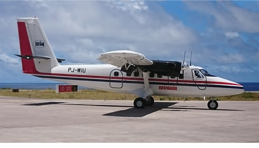
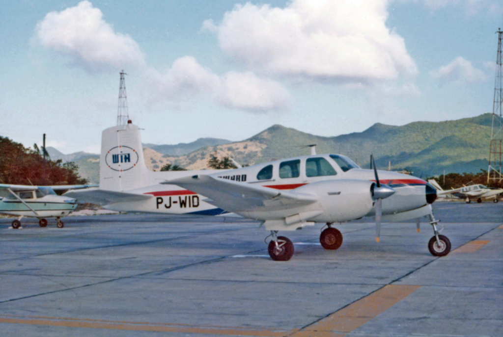
Fairly soon our new fantastic flagship PJ-WIA had to be returned to Canada to repair unexpected severe corrosion problems. We knew, but the Canadian factory apparently did not, that the hot and salt-laden marine environment around the Caribbean islands does not act kindly towards aluminum airplane structures. Actually, fighting corrosion remains a constant and expensive battle. PJ-WIA, or “India Alpha” as we knew it, had to be stripped and repainted and this provided the opportunity to modify the company logo’s a bit. I re-designed the rather “skinny” acronym WIA on the vertical fin by using a more rounded style lettering. Later on, I used this same style lettering for a new Winair company logo which is also still in use today, over 50 years later! In the years following, the technical crew at Winair re-painted all our other airplanes, the Dornier 28 and the Beech Twin Bonanza’s, in the same company colors. We did this all ourselves in the old (but then new) Winair hangar at Juliana Airport. We were not afraid for big jobs!
I don’t believe that there are any airlines in the world which still use a company logo and color scheme on its airplanes which dates back over half a century. I must have done something right, way back then as a young, 26 years old – and first – chief engineer of the second oldest Caribbean airline. (If I am not mistaken, only LIAT is older). Winair, with all its ups and downs over the years is still providing essential service amongst the islands and I am proud to have played a role in its very early years. Seeing Winair’s familiar company color scheme brings back fond memories of years of very hard pioneering work. I wonder if anyone at today’s Winair knows the history and background of Winair’s company logo.
About the author:
Jerry Casius – was Winair’s first chief-engineer 1965-1974. In this picture below he is a bit older. The mechanics crew then included Sabans Al Every and Dennis Dowling, who will well remember the very labor-intensive stripping and painting jobs.

More News
-
 Advertisement
Sign up for your digital invoice and payment confirmation by email
-
 St. Eustatius
UNESCO officially recognizes Statia’s African burial grounds
-
 Education
Information evening state exams secondary education on Bonaire
-
 Bonaire
Health insurer ZJCN requests extensive data for issuing health insurance card
-
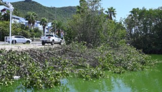 Sint Maarten
Nature Foundation and VROMI condemn illegal mangrove destruction at St. Maarten’s great salt pond
-
 Bonaire
Crocodile sighted on Bonaire on Monday, but not caught
-
 News
NewsBig Live Nature Quiz on November 1
-
 Bonaire
Jeaninne Wong-Loi-Sing onored with Ien Dales Integrity Award 2024
More News
-
Advertisement
Sign up for your digital invoice and payment confirmation by email
-
St. Eustatius
UNESCO officially recognizes Statia’s African burial grounds
-
Education
Information evening state exams secondary education on Bonaire
-
Bonaire
Health insurer ZJCN requests extensive data for issuing health insurance card
-
Sint Maarten
Nature Foundation and VROMI condemn illegal mangrove destruction at St. Maarten’s great salt pond
-
Bonaire
Crocodile sighted on Bonaire on Monday, but not caught
-
News
Big Live Nature Quiz on November 1
-
Bonaire
Jeaninne Wong-Loi-Sing onored with Ien Dales Integrity Award 2024